ShopDreamUp AI ArtDreamUp
Deviation Actions


Description
Hey guys,
First of all I want to say that pretty much everything I used and am inspired from is from DA, everything is used for non-commercial rights and all original owners have been notified by this. Because I do not want to be accused of ripping anything!
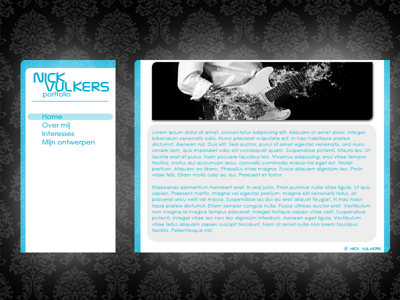
I've been working on my portfolio for school lately but I don't know if there's anything that should be corrected or redone.
What do you guys think?
Things I know I need to fix:
- Copyright thing, looks sh-t.
- Text seems a bit blurred?
And as a little side note; I'm going to continue to making these websites.. I'm going make this my study next year, but I need to show what I can first ofcourse, but I need to make my own good layout and than code it. Really like doing things like these.
Thanks in advance!
First of all I want to say that pretty much everything I used and am inspired from is from DA, everything is used for non-commercial rights and all original owners have been notified by this. Because I do not want to be accused of ripping anything!
I've been working on my portfolio for school lately but I don't know if there's anything that should be corrected or redone.
What do you guys think?
Things I know I need to fix:
- Copyright thing, looks sh-t.
- Text seems a bit blurred?
And as a little side note; I'm going to continue to making these websites.. I'm going make this my study next year, but I need to show what I can first ofcourse, but I need to make my own good layout and than code it. Really like doing things like these.
Thanks in advance!
Image size
800x600px 312.57 KB
© 2009 - 2024 MrXen0
Comments2
Join the community to add your comment. Already a deviant? Log In
Crown moulding is what I think the top needs. Reminds me of wallpaper ") (of course, that's purely opinionated
(of course, that's purely opinionated  (Wink)") )
)
Your content needs more contrast in the values. It's pretty hard to read the text.
I like it. Nice and simple, I like how you divided it, and I really like that blue.
Your content needs more contrast in the values. It's pretty hard to read the text.
I like it. Nice and simple, I like how you divided it, and I really like that blue.